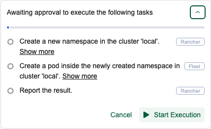
rancher-ai-ui PR 330 (torchiaf) at 6fcbd72, reviewed 2026-11-09. Five commits on top of 5d64721 since your review this morning, no rebase (main is still f8d4357): fbe98fb e2e wait, ab23e27 label wrapping, 0f1261e hover background, febffcf aria-expanded, 6fcbd72 dead CSS.
Where it stands: all four comments fixed, one small aria follow-up, e2e still running
All four of your comments are fixed, checked on the real package in mf 2.16, light and dark (section 1). torchiaf answered each thread.
One new small point: the Show more toggles have no aria-expanded until they are clicked once (card 1). The plan collapse button is right.
e2e: still running on 6fcbd72 when this was written (started 14:26 UTC). This morning it was red on the scroll test; fbe98fb adds a wait to that test.
Suggested next step: approve, with the aria point as one non-blocking comment (section 4). Nothing is posted.
1. Your four comments, checked
Your comment
torchiaf
Checked now
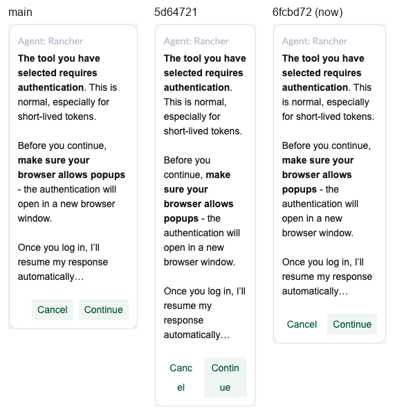
MCP Cancel / Continue split mid-word near the narrowest panel (McpAuthenticationRequest.vue:237)
"Fixed, thanks". ab23e27: overflow-wrap: break-word instead of word-break, and list-style-position dropped, in all four files
Fixed. Whole words on one line at every width from 250 to 340px
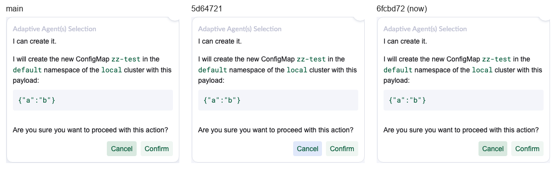
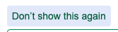
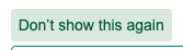
Hovered Cancel: green text on the blue link tint (Confirmation.vue:267)
"I added another custom rule". 0f1261e: background: var(--tertiary-hover, var(--accent-btn)) on hover in the four files, and a note on shell issue 19809
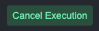
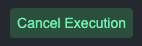
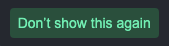
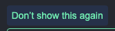
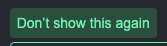
Fixed. The five link buttons (the four Cancels and the recommendation's Don't show this again) hover with main's green, light and dark
The one Show more / Show less toggle has no aria-expanded (StatusInfo.vue:237)
"Done, I also added the aria-expanded to the main collapse button". febffcf
Collapse button right. Show more toggles miss it until the first click, card 1
Dead background: transparent on .cancel-button (StatusInfo.vue:263)
"Done". 6fcbd72
Gone. The class still carries the shared white-space and icon margin, and the tests use it
fbe98fb also adds a wait to the scroll e2e test that was red this morning: after each reply it waits for the "processing" state to go away before scrolling up. That matches the race found in round 4.
Comment 1: the MCP buttons at a 250px panel
Panel width
MCP buttons at 6fcbd72
Agent recommendation
250px
one line, whole words
no sideways scroll
260px
one line, whole words
no sideways scroll
270px
one line, whole words
no sideways scroll
280px
one line, whole words
no sideways scroll
300px
one line, whole words
no sideways scroll
340px
one line, whole words
no sideways scroll
The recommendation buttons still wrap between words at 250 to 270px, like in torchiaf's screenshot. Main scrolls sideways there instead.
Comment 2: hovered link buttons, every case
All five link buttons. The text stays theme green at rest and on hover in every build. At rest the link Cancels have no background (main has a light green one); that is the designer's "the cancel button should be a link".
Button
main f8d4357 hovered
round 4 5d64721 hovered
now 6fcbd72 hovered
Cancel Plan waiting for approval
green tint
blue tint
green tint
Cancel Execution Plan running
green tint
blue tint
green tint
Cancel Confirmation before a change
green tint
blue tint
green tint
Don’t show this again Agent recommendation (system message)
green tint
blue tint
green tint
Cancel MCP sign-in request
green tint
blue tint
green tint
Same in the dark theme
Button
main f8d4357 hovered
round 4 5d64721 hovered
now 6fcbd72 hovered
Cancel Plan waiting for approval
green tint
blue tint
green tint
Cancel Execution Plan running
green tint
blue tint
green tint
Cancel Confirmation before a change
green tint
blue tint
green tint
Don’t show this again Agent recommendation (system message)
green tint
blue tint
green tint
Cancel MCP sign-in request
green tint
blue tint
green tint
Comment 3: aria-expanded, step by step
Read from the DOM of the real package (the attribute sits on the native button). Highlighted rows have a Show more toggle with no aria-expanded.
isTaskExpanded starts as {}, so isTaskExpanded[index] is undefined until the first click, and Vue leaves an attribute out when its value is undefined. A screen reader hears a plain "Show more, button" with no collapsed state. After one open and close it reads false. Collapsing and reopening the plan resets the map, so the attribute disappears again. !!isTaskExpanded[index] fixes all three. The collapse button binds !isPlanCollapsed, a real boolean, and is right: Enter and Space toggle it once and focus stays.
2
e2e
run 42634734531
FYI, running
Still running on 6fcbd72 (started 14:26 UTC). At 5d64721 it failed 3 of 3 on the scroll test It should not scroll when interacting with actionable items. fbe98fb now waits for the processing state to go away after each reply before the test scrolls up. That fits the round-4 diagnosis: scrollToBottom in useScrollComposable unhooks the scroll listener until the next frame, so a scroll in that frame is lost.
3
Seen and left out on purpose
Your call
RouteButton.vue and ResourceButton.vue still have the old word-break label block. The PR doesn't touch them, and on main they behave the same.
Both toggles change their label and also expose aria-expanded, so a screen reader says "Show less, expanded". Redundant, not wrong.
The temporary rule is still copied into four files (a single place would need :deep or global CSS, both against the checklist). It is fenced with TODO start and end lines now, so it is easy to remove after shell issue 19809.
The new hover rule only reaches those five buttons: they are the only link buttons in the four files, and none has a disabled binding.
3. What was checked
Check
Result
Real build-pkg at 6fcbd72 swapped into mf 2.16, light and dark, every button and link in nine chat cases
Since round 4 only the hover background of the five link buttons changed, now the same green as main. Nothing else moved. Same four 404s as main, from the environment
The PR preview (standalone build), same inventory
Same colours as the real package on all 24 elements
Narrow panel sweep, 250 to 340px, light and dark
No mid-word splits, nothing sticks out, no sideways scroll
aria-expanded through click, Enter and Space, plan collapse and reopen
Card 1
Code review of the five commits against the team checklist
No blockers. Styles scoped, no :deep, no new strings, the e2e wait uses an existing page-object helper
CI at 6fcbd72
unit, lint, i18n green; e2e: running
Not checked
A real agent conversation (replies scripted), Firefox and Safari, a real screen reader
4. Suggested review (draft, not posted)
Body
Thanks, all four are fixed. One small thing on the new aria-expanded below, not blocking.
StatusInfo.vue:239
isTaskExpanded[index] is undefined until the first click, so Vue leaves aria-expanded off and a screen reader hears a plain button. !!isTaskExpanded[index] gives false from the start, and also after the plan is collapsed and opened again, which resets the map.
 green tint
 blue tint
 green tint
 green tint
 blue tint
 green tint
 green tint
 blue tint
 green tint
 green tint
 blue tint
 green tint
 green tint
 blue tint
 green tint
 green tint
 blue tint
 green tint
 green tint
 blue tint
 green tint
 green tint
 blue tint
 green tint
 green tint
 blue tint
 green tint
 green tint
 blue tint
 green tint